BRAND IDENTITY | SOCIAL MEDIA (ORGANIC) | DIGITAL | PRINT | PACKAGING
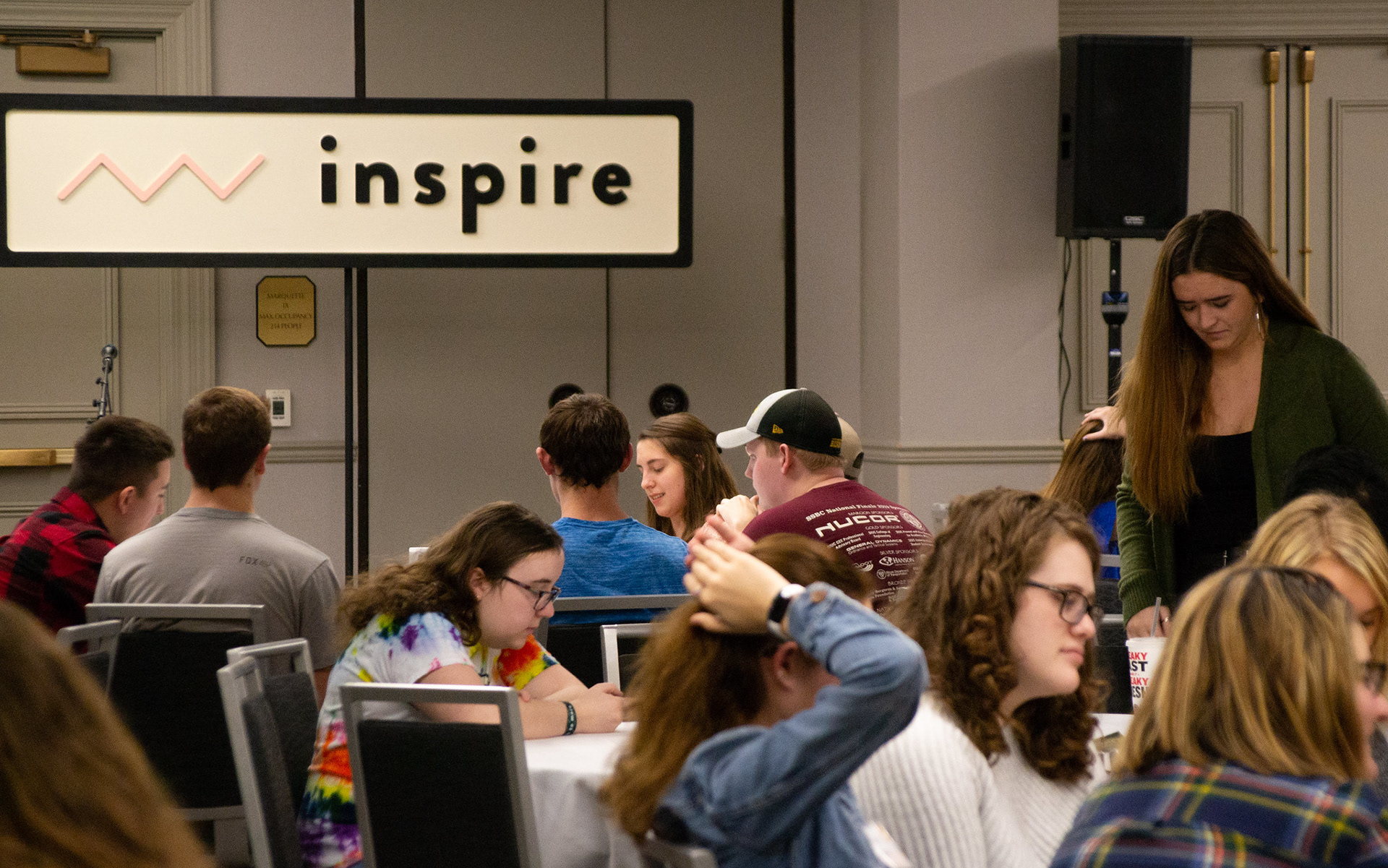
Winter Conference gathers students from different cities, on different journeys, moving together toward exploring Christianity and a life well-lived. For this year, the conference featured a new conference experience: paths. The four paths (Explore, Inspire, Multiply, Beyond) allowed students to customize their conference experience. Since we had this new aspect, the design team was tasked with refreshing the Winter Conference brand. The Winter Conference brand would then be applied across everything for the conference including print, web, social media, and on-site assets.
Each path is represented by an icon, which was used individually in designs. These icons were also applied throughout designs in two main pattern applications: subtle larger background patterns with all the icons, and smaller patterns with individual icons. The designs explored using the brand colors in two ways: more white-based designs and more color-based designs. Our team wanted to design pieces that explored the brand differently, but ultimately looked cohesive and could work together.
Tiffany Wooten: Creative Director | Senior Designer: Rachael Abbott | Designer: Sonal Mecwan


